Table of Contents >> Show >> Hide
- Quick Color Snapshot
- What Patriot Blue Looks Like in Real Life
- Where Patriot Blue 2064-20 Shines
- Coordinating Colors That Play Nice With Patriot Blue
- Materials + Finishes That Make Patriot Blue Look Even Better
- Choosing the Right Sheen (Because Shine Changes Everything)
- How to Paint Patriot Blue Like You Meant It
- Similar Colors (If You Love Patriot Blue but Want to Compare)
- Final Thoughts: Is Patriot Blue 2064-20 Right for You?
- Experiences With Patriot Blue 2064-20 (What People Tend to Notice)
If you’re hunting for a deep blue that feels confident without screaming “I own a yacht,” Patriot Blue 2064-20 is the kind of color that shows up, looks sharp, and doesn’t need to brag about it. It’s a classic, dark blue that can anchor a room the way a great pair of jeans anchors a closet: everything else suddenly behaves.
One quick heads-up before we dive in: depending on where you’re viewing it (or which fan deck you’re holding), you may see this color referenced as Patriot Blue 2064-20 or shown as having been renamed in some materials. The safe way to shop is to focus on the color number: 2064-20. Names can change; numbers are the introvert in the corner who never lies.
Quick Color Snapshot
What it is
Patriot Blue 2064-20 sits in that “dark blue with backbone” zonericher than a typical navy, cleaner than a muddy blue-black, and bold enough to hold its own on walls, built-ins, or a statement door.
How dark are we talking?
This shade has a low LRV (Light Reflectance Value), which means it reflects relatively little light and will read deep and dramaticespecially in rooms without strong daylight. That’s not a warning. That’s the point.
Color family + collection
Patriot Blue 2064-20 is part of Benjamin Moore’s Color Preview collectiona huge spectrum-style collection designed for people who enjoy color (and don’t break out in hives when someone says “saturated”). The collection is known for offering a wide range of hues organized by hue and value.
Digital color codes (useful, but not gospel)
If you’re trying to mock up a mood board or match textiles online, you’ll often see Patriot Blue represented around #184A7C (with similar RGB values depending on the source). Treat these as rough screen shorthand, not a substitute for a real samplescreens are basically professional liars when it comes to paint.
What Patriot Blue Looks Like in Real Life
Undertones: the plot twist factor
Deep blues can shift depending on lighting, nearby materials, and sheen. Patriot Blue tends to stay “blue-forward,” but in certain conditions it can lean slightly cooler or pick up a hint of depth that feels almost inky. Translation: it’s steady, but it still has rangelike an actor who can do comedy and drama.
Lighting changes everything (yes, even your personality)
Expect Patriot Blue to look a bit brighter and more energetic in strong daylight, and moodiersometimes nearly navyat night under warm bulbs. If your room faces north or has limited natural light, you’ll get the most “velvet evening” version of it. South-facing rooms usually show more clarity and richness.
How to sample it without losing your mind
Sampling is non-negotiable with dark blues. The best approach is to test on a movable board or use a quality peel-and-stick sample so you can view the color on multiple walls and at different times of day. Keep the sample large, observe it morning to night, and hold it next to your flooring, sofa fabric, and any big “can’t change it” elements.
- Go big: tiny swatches make dark colors look flatter and less honest.
- Move it around: one wall might be sunshine; the next wall might be a cave.
- Watch for shifts: blue can look crisp in daylight and deeper (sometimes more serious) at night.
Where Patriot Blue 2064-20 Shines
1) Accent walls that actually feel intentional
Deep blue works beautifully as an accentespecially in entryways, hallways, and rooms where you want a hit of drama without color-drenching every surface. Patriot Blue is strong enough to read “designer choice,” but classic enough not to feel trendy in a year.
2) Dining rooms and libraries (a.k.a. the “fancy without trying” rooms)
This is a natural fit for dining rooms, studies, and reading nooks. It creates a cocoon effect that feels welcoming, especially paired with warm lighting, wood tones, and art with lighter mats or frames.
3) Home offices that feel focused
If you’re tired of beige walls whispering “nap time,” Patriot Blue can make a home office feel more purposeful. Pair it with a lighter ceiling and trim to keep things crisp, then add texturelinen curtains, a wool rug, or a leather chairto keep it from feeling flat.
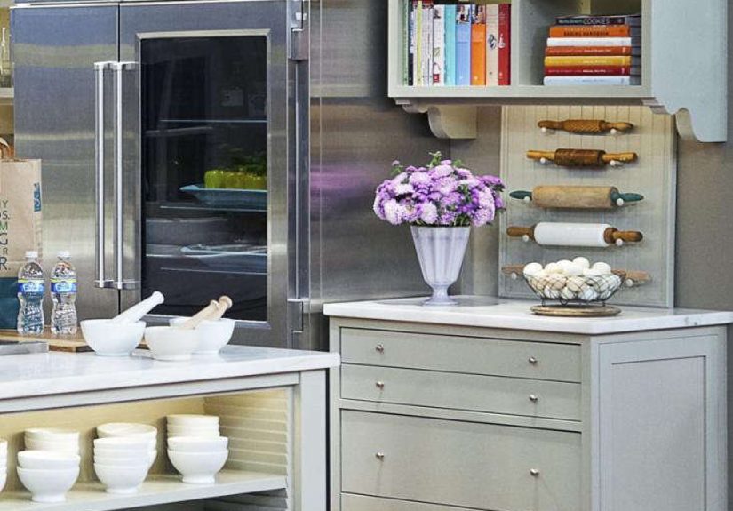
4) Cabinets, built-ins, and kitchen islands
Patriot Blue looks especially good on cabinetry when you want depth without going full black. A kitchen island in this shade can ground a light, airy kitchenparticularly when you balance it with pale countertops and a warm wood floor. Use a durable finish (more on that below).
5) Front doors and statement interior doors
Want a door color that feels classic, not quirky? Patriot Blue is a strong contender. It’s bold enough to pop against white trim, but not so loud that your neighbors start asking if you’re launching a nautical-themed bed-and-breakfast.
Coordinating Colors That Play Nice With Patriot Blue
The easiest way to make Patriot Blue feel “expensive” is to pair it with clean, light neutrals and one or two warm accents. Think of it like a blazer: it looks best with the right supporting cast.
Benjamin Moore coordinating picks (ready-made helpers)
Benjamin Moore’s own coordinating suggestions for 2064-20 include light neutrals and deep accentshelpful if you want a starting point that’s already been thoughtfully curated.
Three simple palette formulas
Palette A: Crisp + Classic
- Walls / anchor: Patriot Blue 2064-20
- Trim: a clean white or soft off-white
- Accents: black hardware, glass, and bright white textiles
Palette B: Soft + Modern
- Anchor: Patriot Blue 2064-20 (accent wall or built-ins)
- Supporting neutral: light gray or greige on adjacent walls
- Accents: warm brass, natural oak, and creamy whites
Palette C: Moody + Layered
- Anchor: Patriot Blue 2064-20 on walls
- Contrast: softer blue-grays and textured whites
- Accents: cognac leather, walnut, and warm metallics
Use the 60/30/10 rule (so the room doesn’t turn into a blue smoothie)
A simple design guideline is to use about 60% dominant color (often your wall color or main neutral), 30% secondary color (furniture, rugs, drapes), and 10% accent color (decor, art, pillows). If Patriot Blue is your dominant, keep the other layers lighter or warmer so the room feels balanced.
Materials + Finishes That Make Patriot Blue Look Even Better
Wood tones
Patriot Blue loves wood. Lighter woods (white oak, maple) keep it fresh and contemporary. Medium-to-dark woods (walnut) make it feel classic and slightly moody. If your space has a lot of wood already, Patriot Blue can be your “calm backdrop” that lets the grain do the talking.
Metals
Brass and warm metallics add a rich, tailored vibe. Matte black hardware feels modern and crisp. Chrome and nickel can work tooespecially if you’re keeping the whole palette cool and clean.
Stone + tile
White or light stone (marble-look quartz, pale granite) creates high contrast that feels bright and upscale. Patriot Blue also pairs nicely with warm, earthy tilethink creamy zellige or subtle beige limestone.
Choosing the Right Sheen (Because Shine Changes Everything)
Paint sheen isn’t just about aestheticsit affects how the color reads and how easy it is to clean.
Walls
- Matte / flat: great for hiding imperfections and giving Patriot Blue a velvety look.
- Eggshell: a practical step up in washability while staying fairly subtle.
Trim + doors
- Satin / semi-gloss: crisper edges, more durability, and easier wiping.
Cabinets + built-ins
- Satin or semi-gloss: typically the sweet spot for cleaning and durability.
- High-gloss: dramatic and sleek, but it shows every flawlike HD video for your wood grain.
How to Paint Patriot Blue Like You Meant It
Step 1: Prep is the glow-up
Clean the walls, address dings and nail holes, and make sure the surface is smooth. Dark colors make uneven texture and sloppy edges more obvious, so this is not the moment to “wing it.”
Step 2: Prime smart (especially if you’re going darker)
When you’re painting a darker hue, primer matters. A quality primer creates a consistent base so the color develops evenly. Many pros recommend a tinted primer for dark shades to help coverage and reduce the number of coats.
Step 3: Plan for multiple coats
Dark blues often need two coats, sometimes more depending on what you’re covering and the product you’re using. Let coats dry properly between applications so you don’t trap moisture and end up with patchy sheen or dragging.
Step 4: Keep a “wet edge”
Work in manageable sections and overlap slightly to avoid lap marksespecially important with deep colors where streaks can show up like a bad haircut in a yearbook photo.
Similar Colors (If You Love Patriot Blue but Want to Compare)
If you’re close-but-not-100%-sure, it helps to compare 2064-20 against nearby blues. Benjamin Moore lists several similar options, including deep royal-leaning blues and other saturated dark tones. Comparing these side-by-side will help you decide whether you want something slightly brighter, slightly deeper, or slightly more muted.
Final Thoughts: Is Patriot Blue 2064-20 Right for You?
Patriot Blue 2064-20 is for anyone who wants a bold blue that still feels timeless. It can read classic, modern, moody, preppy, or luxe depending on what you pair it with. If you love the idea of a dark anchor color but don’t want to go all the way to black, this is a strong bet.
Your best next step is simple: sample it, move it around, and look at it in your real lighting. Once you see it next to your floors, your trim, and your couch (the real decision-makers), you’ll know whether it’s “the one.”
Experiences With Patriot Blue 2064-20 (What People Tend to Notice)
Here’s what usually happens when someone brings Patriot Blue 2064-20 into a home for the first time: they sample it, they panic for about 30 seconds, and then they start smiling. That brief panic is normal. Dark blues have a way of looking very intense in a tiny swatchlike the color is trying to start a conversation you weren’t ready to have. The moment you give it a real, large sample and step back, the tone starts to make sense.
A common “aha” moment shows up around day two of sampling. In the morning, the color often looks clearer and a touch more energetic, especially in natural light. People describe it as feeling confident and crisplike it wants to be paired with a white shirt and a good playlist. Later in the day, particularly under warm lamps, the same blue gets deeper and more dramatic. That’s when it starts feeling cozy, slightly mysterious, and perfect for a reading chair you pretend you use every night.
Another experience that comes up a lot: Patriot Blue becomes the unexpected MVP when paired with natural materials. Homeowners who thought the room might feel “too dark” often find that once they add warm wood, woven textures, or brass accents, the blue reads rich rather than heavy. A light oak shelf, a walnut console, or even a simple jute rug can keep the space grounded and approachable. It’s like the color relaxes once it has something warm to lean against.
Painting day has its own personality. Dark colors demand cleaner edges, and people notice quickly that rushing the cut-in lines is a mistake. But once the first coat is on, there’s usually a moment where the wall looks blotchy and everyone thinks, “We ruined the house.” That’s just the first-coat illusion. By the second coat, Patriot Blue typically evens out and starts showing its true depth. Many DIYers say the biggest improvement comes from using a smart primer strategy (often tinted) and giving each coat enough dry time so the finish doesn’t get streaky.
Finally, there’s the “living with it” phasewhen the room is put back together and the color starts doing its job quietly. People often mention how Patriot Blue makes art look sharper, makes white trim look cleaner, and makes soft furnishings feel more intentional. Even neutral furniture can suddenly look curated because the wall color gives everything contrast. And if it’s used on cabinets or built-ins, the most common feedback is that it adds structure to the roomlike the space has better posture.
In other words: Patriot Blue 2064-20 tends to feel bold at first, then quickly becomes the color you wonder how you lived withoutespecially once you see it at night with warm lighting and a couple of well-chosen textures. It’s not a “background” color. It’s a “the room finally has a point of view” color.