Table of Contents >> Show >> Hide
- What Color Is Benjamin Moore Pale Oak, Exactly?
- Why Designers Keep Coming Back to Pale Oak
- How Benjamin Moore Pale Oak Looks in Different Lighting
- The Best Rooms for Benjamin Moore Pale Oak
- What Colors Pair Beautifully With Pale Oak?
- Pale Oak vs. Other Popular Benjamin Moore Neutrals
- When Benjamin Moore Pale Oak Might Not Be the Best Choice
- Sampling Tips Before You Commit
- Living With Pale Oak: The Real-World Experience
- Final Thoughts
If paint colors had personalities, Benjamin Moore Pale Oak would be that calm, well-dressed friend who somehow looks polished in sneakers, loafers, or bare feet. It is soft without being sleepy, warm without turning buttery, and neutral without feeling like a sad rental wall that gave up on joy in 2008. That balancing act is exactly why Benjamin Moore Pale Oak has become a favorite among designers, homeowners, and anyone who has ever stared at a dozen “almost white” swatches and whispered, “Why are they all different?”
Pale Oak sits in a very useful sweet spot. It is light enough to brighten a room, but it is not the kind of bright that makes your sofa look guilty. It brings more depth than a plain white, more softness than a typical gray, and more flexibility than many beige tones that can go a little too peanut-butter-toast when the lighting changes. In other words, it is a grown-up neutral with excellent manners.
What Color Is Benjamin Moore Pale Oak, Exactly?
Benjamin Moore Pale Oak OC-20 is best described as a light greige with warm gray undertones. Depending on the room, it can read as a soft taupe, a creamy greige, or even an off-white with a little extra backbone. Benjamin Moore places it in the brand’s Off White Collection, which tells you a lot right away: this is not a heavy beige and not a cool, steely gray. It is a nuanced neutral designed to sit quietly in the background while still doing a lot of work.
Its LRV of 68.64 means it reflects a solid amount of light. That makes Pale Oak bright enough for walls, hallways, bedrooms, and open living areas, but not so reflective that it goes flat or sterile. Many people love it because it gives the room a softly lit, “yes, I own actual throw pillows” look without demanding constant explanation.
What makes Pale Oak especially interesting is that it does not stay in one lane. In some rooms, it leans a little more beige. In others, the gray shows up more clearly. In still others, it takes on a faint blushy warmth that feels elegant rather than pink. If that sounds dramatic, it is, but only in the tasteful theater-kid sense.
Why Designers Keep Coming Back to Pale Oak
The popularity of Pale Oak paint color is not random. Designers repeatedly recommend it because it solves a common decorating problem: people want a home that feels bright and airy, but they do not want walls that look sharp, icy, or hospital-clean. Pale Oak offers a softer alternative to stark white while still feeling fresh.
That is why this shade shows up again and again in conversations about best neutral paint colors, calming interiors, and rooms that work across multiple styles. Traditional home? Pale Oak fits in. Modern organic space with white oak and linen? Still works. Transitional home with brass, marble, and a suspiciously expensive lamp? Also works. It plays well with warm and cool palettes alike, which is one reason it has such long-term appeal.
Another reason people love it is emotional, not just technical. Pale Oak has a welcoming quality. It feels cozy without being dark, polished without being fussy, and elegant without insisting you never eat chips on the couch. That is a hard combo to beat.
How Benjamin Moore Pale Oak Looks in Different Lighting
Lighting is where Pale Oak earns its reputation as a chameleon. Not a wild, neon lizard of chaos, but a subtle one. The kind that politely adjusts its sweater depending on the weather.
North-Facing Rooms
In cooler north light, Pale Oak tends to show more of its gray side. It can feel slightly more muted and refined, which is great if you want a neutral that still looks soft instead of chilly. This is often where people appreciate its depth the most.
South-Facing Rooms
In warm, bright southern exposure, Pale Oak can look creamier and cozier. The beige-taupe warmth becomes more visible, but it usually stays restrained. It does not suddenly turn into a tan wall shouting about Tuscany.
East- and West-Facing Rooms
Morning and afternoon light bring more movement. East-facing rooms can make it feel gentle and airy earlier in the day, while west-facing spaces may pull out a richer warmth by late afternoon. This changing quality is one reason so many designers call it versatile instead of boring.
The big takeaway is simple: sample Pale Oak before painting a whole room. Paint large swatches on multiple walls and check them in daylight, lamplight, and the sort of lighting that happens when you are folding laundry at 9:37 p.m. That is the real test.
The Best Rooms for Benjamin Moore Pale Oak
Living Rooms
Pale Oak is excellent in living rooms because it creates a soft backdrop for everything else: art, wood tones, layered textiles, black accents, warm brass, and even bold upholstery. It gives a room a calm, collected foundation without stealing attention from the furniture.
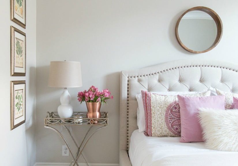
Bedrooms
If your goal is restful, Pale Oak is a strong candidate. It has enough warmth to feel comforting and enough neutrality to keep the space from feeling visually busy. This is especially helpful in bedrooms where you want a cocoon-like mood without going full cave.
Bathrooms
In bathrooms, Pale Oak often looks clean, serene, and slightly luxe. It pairs beautifully with marble, soft white tile, brushed nickel, warm brass, and natural wood vanities. It also tends to flatter skin tones better than colder grays, which is a nice bonus when mirrors are already being rude.
Hallways and Entryways
Because it reflects light well, Pale Oak is a smart option for transitional spaces that need brightness but also need to connect different rooms. It is one of those colors that helps a home feel cohesive rather than patched together from twelve late-night Pinterest moods.
Kitchens and Cabinetry
Pale Oak can work beautifully in kitchens, especially when paired with white oak, marble, soapstone, or darker accents. It has also been used successfully on cabinetry in classic homes where a soft painted finish feels more timeless than a bright white. If your kitchen includes natural wood, stone, and layered neutrals, Pale Oak can be a particularly handsome choice.
What Colors Pair Beautifully With Pale Oak?
One of the best things about Benjamin Moore Pale Oak is how cooperative it is. This color is not here to start drama. It is here to make the rest of the room look expensive.
Whites for Trim and Ceilings
If you want a crisp, clean contrast, Chantilly Lace is a classic option. If you prefer something softer and less stark, White Dove or Simply White can create a gentler transition. The right trim white depends on how much contrast you want and how warm your lighting is.
Deep Accent Colors
Pale Oak looks especially pretty with charcoal, soft black, moody blue-gray, and muted wine or burgundy tones. Benjamin Moore’s own coordinating suggestions include Gray Cardigan, Dinner Party, and Wrought Iron, which tells you a lot about how far this supposedly quiet paint can stretch.
Natural Materials
This color shines with white oak, medium oak, walnut, linen, jute, marble, and unlacquered brass. It also works nicely with both brass and nickel finishes, which is useful if your home is already mixing metals like a rebel with good taste.
Pale Oak vs. Other Popular Benjamin Moore Neutrals
Pale Oak vs. Balboa Mist
These two get compared a lot, and for good reason. Balboa Mist is often seen as slightly cooler and more gray, while Pale Oak feels a touch warmer and softer. If you want a neutral with a creamier, more relaxed mood, Pale Oak usually wins.
Pale Oak vs. White Dove
White Dove is more clearly a white, while Pale Oak has more body and depth. If you want your walls to look white but not flat, Pale Oak is often the better fit. If you want a classic warm white, White Dove remains a favorite.
Pale Oak vs. Edgecomb Gray
Edgecomb Gray generally reads deeper and more beige than Pale Oak. If your goal is a lighter, airier neutral that still has warmth, Pale Oak is the softer choice.
Pale Oak vs. Classic Gray
Classic Gray is another “not-quite-white” option, but it can feel a little more delicate and less grounded. Pale Oak usually brings more visible greige depth, which some people prefer in larger rooms or open floor plans.
When Benjamin Moore Pale Oak Might Not Be the Best Choice
No paint color is universal, and Pale Oak is not here to defeat physics. In very dark rooms with minimal natural light, it may read flatter or grayer than expected. If you want a crisp white, it will probably look too creamy. If you want an obvious beige, it may feel too subtle. And if your fixed finishes pull heavily pink or yellow, you will want to sample carefully to make sure Pale Oak stays elegant instead of awkward.
It is also not the best choice if you are chasing a super-modern, icy palette. Pale Oak is too warm and human for that. It wants softness, texture, and a little visual grace. It does not want to live inside a stainless-steel cube.
Sampling Tips Before You Commit
- Paint large swatches on at least two or three walls.
- View the color morning, afternoon, and evening.
- Test it next to trim, flooring, countertops, and fabric.
- Check it under warm and cool bulbs.
- Compare it with one or two close alternatives such as Balboa Mist, White Dove, or Edgecomb Gray.
This step matters because Pale Oak is subtle. And subtle paint colors are like quiet people at a party: you have to spend a little time with them before you really understand what they are doing.
Living With Pale Oak: The Real-World Experience
Here is the part paint decks do not tell you. Living with Benjamin Moore Pale Oak is less about one dramatic reveal and more about a long series of tiny, satisfying moments. It is the way the walls look a little creamy with your first cup of coffee, then calmer and grayer by lunchtime, then softly cocooning by dinner when the lamps are on and the rest of the house has finally stopped shouting.
One of the most common experiences people have with Pale Oak is relief. Real relief. The kind that comes after testing whites that feel too sterile, grays that feel too cold, and beiges that somehow make every room look like a giant graham cracker. Pale Oak often lands in that magical middle ground where the walls feel finished, but not forced. The room looks brighter, but not blinding. There is warmth, but no syrupy sweetness. It is a neutral that lets you exhale.
Another thing homeowners notice is how kind Pale Oak is to everyday life. It is soft behind family photos. It flatters wood furniture without turning a room orange. It makes black accents look crisp and intentional. It does not fight with a patterned rug, a marble countertop, or a linen sofa. In a world where many things demand attention, Pale Oak behaves like a team player. It is not the loudest voice in the room, and that is exactly why people keep choosing it.
There is also a practical, emotional benefit to this color in open-concept homes. When used across hallways, living spaces, bedrooms, or connecting areas, Pale Oak creates a sense of continuity that makes the house feel more settled. Not staged. Not trendy. Just settled. Rooms feel like they belong to the same home, which is more powerful than people often expect. A cohesive paint color quietly removes visual stress, and once you experience that, it is hard to go back.
Then there is the lighting factor, which turns Pale Oak into a color you keep noticing in a good way. On sunny days it can feel almost off-white, especially next to brighter trim. On cloudy days it gathers a little more depth. In the evening, it becomes cozy without going muddy. That subtle shift is part of the charm. It gives the room movement and softness, which is a fancy way of saying it never feels dead on the wall.
Of course, Pale Oak is not a miracle worker. If your room is very dark, it can lean flatter. If your finishes are very pink or very yellow, you will want to sample before making a lifelong commitment with a paint roller. But in the right setting, it has an unusually livable quality. It is easy to decorate around, easy to look at for years, and easy to recommend to someone who wants a home to feel brighter, calmer, and more timeless.
That may be the best way to describe the experience of Pale Oak: it feels easy. Not boring-easy. Not default-easy. More like quietly luxurious easy. It does the difficult job of making a room feel finished without making itself the whole story. And honestly, in a decorating world full of colors trying very hard to become a personality trait, that kind of confidence is pretty refreshing.
Final Thoughts
Benjamin Moore Pale Oak earns its popularity because it solves several design problems at once. It is light but not stark, warm but not yellow, neutral but not flat, and versatile without being dull. It works beautifully in living rooms, bedrooms, bathrooms, hallways, and kitchens, and it partners well with wood, stone, white trim, dark accents, and mixed metals.
If you are looking for a warm greige paint that feels polished, calm, and highly livable, Pale Oak deserves a place on your shortlist. It may not be the flashiest paint on the wall, but that is part of the point. Some colors impress you in a sample card. Pale Oak impresses you on a random Tuesday in real life, when the light is good, the room feels settled, and everything suddenly looks like it belongs.