Table of Contents >> Show >> Hide
- What Is Nate Berkus’ Foolproof Paint Formula?
- Why This Formula Works So Well
- Why Picking Paint Colors Feels So Hard
- How to Use the Formula in Real Life
- Room-by-Room Examples of Nate Berkus’ Formula
- Paint Mistakes This Formula Helps You Avoid
- When You Can Bend the Formula
- A Simple Step-by-Step Process to Pick the Right Paint Palette
- Step 1: Identify the room’s fixed elements
- Step 2: Decide what mood you want
- Step 3: Choose three to five neutral candidates
- Step 4: Test large samples in the room
- Step 5: Pick a consistent white for trim and ceiling
- Step 6: Select a deeper related shade
- Step 7: Live with the samples for a day or two
- Experiences That Prove This Formula Actually Works
- Conclusion
Choosing paint colors should be simple. You look at a swatch, point dramatically, and announce, “That one.” Instead, it usually turns into a tiny emotional crisis in the aisle between eggshell and satin. The beige looks pink at home. The gray suddenly goes green. The white you swore was “clean and classic” ends up feeling like a dentist’s waiting room with better pillows.
If that sounds familiar, Nate Berkus has a refreshingly sane solution. Instead of treating paint like a high-stakes personality test, he uses a practical three-color formula that brings calm, cohesion, and enough contrast to keep a room from looking flat. Better still, the formula is flexible enough for real homes, not just glossy magazine spreads where no one seems to own a phone charger.
The beauty of this approach is that it does not ask you to become a color theorist overnight. It gives you a structure: start with a soft neutral on the walls, add crisp white on trim and ceilings, and finish with a deeper related shade on doors or window frames. That’s it. Not fifty paint chips. Not a twelve-tab spreadsheet. Just a smart palette that works because it respects the architecture of a room, the way light changes throughout the day, and the fact that your sofa, rug, and cabinets already exist and deserve a vote.
In this guide, we’ll break down why Nate Berkus’ formula works, how to adapt it to different rooms, what mistakes it helps you avoid, and how to use it without ending up in a weekend-long swatch spiral. We’ll also dig into the real-life experiences that make paint selection feel so tricky in the first place, because yes, your walls are allowed to stop gaslighting you.
What Is Nate Berkus’ Foolproof Paint Formula?
At the center of Berkus’ approach is a simple three-part palette that removes the guesswork from choosing paint colors:
1. Start with a soft neutral wall color
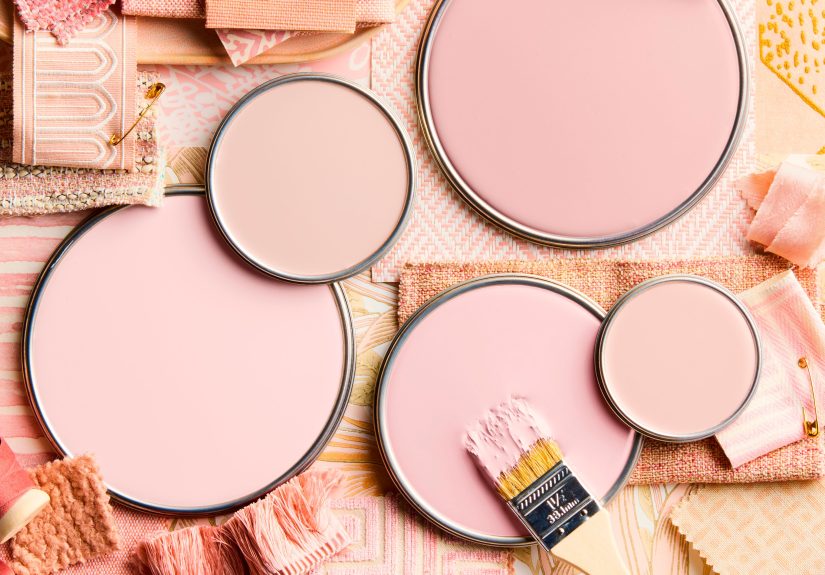
This is your foundation. Think warm off-whites, creamy beiges, soft greiges, light taupes, or subtle stone-inspired tones. Berkus favors neutrals because they create an inviting backdrop without boxing you into one style. A soft neutral can lean classic, modern, cozy, minimal, rustic, or polished depending on the furniture and texture around it.
2. Use a crisp white for trim, baseboards, and usually ceilings
White trim acts like punctuation. It gives the walls definition, sharpens architectural lines, and keeps the room from looking muddy. It also helps the wall color read more clearly. If your neutral wall paint is the leading actor, white trim is the supporting cast that quietly deserves an award.
3. Add a deeper version of the wall color on doors or window frames
This is the move that makes the room look intentional instead of accidental. A deeper shade adds weight and dimension. It can highlight a doorway, make window trim feel richer, and create a layered look without introducing a random extra color that starts a fight with the rug.
Together, these three tones create a balanced room: soft, bright, and grounded. It is a formula that feels elevated because it is restrained. Rather than throwing a loud accent wall into the mix and hoping for the best, it builds depth by varying tone and placement.
Why This Formula Works So Well
Paint gets overwhelming when every color is treated as a standalone decision. Berkus’ method works because it turns the room into a coordinated system. Instead of asking, “What color should my walls be?” you ask, “What wall color, trim color, and accent shade belong together?” That shift is huge.
First, soft neutrals are versatile. They play nicely with wood floors, stone counters, brass hardware, black accents, and most upholstery colors. They also age well. Trendy paint can be fun, but neutrals are the grown-ups in the room. They stay calm while your décor changes around them.
Second, crisp white trim creates separation and clarity. Without that contrast, rooms can blur together, especially if the wall color has complex undertones. White trim helps edges look clean and architectural details feel deliberate.
Third, a deeper related shade adds depth without chaos. This is important because many homeowners try to create interest by introducing an unrelated accent color. Sometimes that works. Other times it looks like the room lost a bet. A darker version of the wall color keeps the palette cohesive while still adding visual weight.
Most importantly, the formula makes it easier to decide. And that matters, because decision fatigue is real when you are staring at 400 shades of something called “whispered linen cloud.”
Why Picking Paint Colors Feels So Hard
If paint color selection has ever made you question your eyesight, your instincts, and maybe your future, you are not alone. Paint is tricky for a few very real reasons.
Lighting changes everything
A color can look warm and creamy in the store, cool and flat in the morning, golden by late afternoon, and vaguely moody under artificial light at night. North-facing rooms tend to feel cooler, while rooms with strong southern or western exposure often intensify brightness and warmth. That means the same paint can behave like two different personalities depending on the space.
Undertones are sneaky
That “simple neutral” is rarely simple. Beige can have pink, yellow, or green undertones. Gray can pull blue, green, violet, or brown. White can look soft and warm in one room and stark in another. Undertones are what make a paint color feel right or weird, even when you cannot immediately explain why.
Surrounding finishes influence the result
Your floors, countertops, tile, cabinets, rugs, and furniture all affect how paint is perceived. A wall color that looks lovely beside a neutral sample card can look completely off next to orange-toned wood flooring or cool marble. Paint never lives alone, no matter how much the swatch tries to sell you that fantasy.
Small samples lie
Tiny chips are helpful for narrowing options, but not for final decisions. On a little card, a color may seem balanced. Across a full wall, it can look much darker, brighter, cooler, or flatter than expected. Bigger samples tell the truth. Tiny ones merely flirt with it.
How to Use the Formula in Real Life
Begin with what already lives in the room
Before you choose paint, look at the nonnegotiable elements: flooring, countertops, tile, major furniture, art, and textiles. A favorite rug or sofa can be the clue that keeps you from choosing a wall color that technically looks nice but feels totally disconnected from the rest of the room.
Choose your neutral based on light, not just preference
If your room is north-facing or naturally dim, warmer neutrals usually feel friendlier. In bright rooms, a neutral with a slightly cooler or cleaner feel can prevent the space from becoming too yellow or washed out. The goal is not to follow a rigid rule. It is to balance the light your room already has.
Keep the white trim consistent
One of the smartest ways to create flow from room to room is to use the same white on trim and doors throughout much of the home. This consistency helps the house feel connected, even if each room uses a different wall color. It is like giving the entire house one reliable pair of shoes.
Use the darker tone with purpose
The deeper related shade works best when it highlights something architectural. Interior doors, built-ins, window frames, mudroom cabinetry, and even a fireplace surround can all benefit from this move. It gives the room a collected, layered look without introducing visual noise.
Sample before you commit
Paint large swatches or use large peel-and-stick samples. Move them around the room. Check them in daylight, at dusk, and at night with lamps on. Test them near trim, flooring, and furniture. A paint color should survive morning light and your evening table lamp before it earns wall privileges.
Room-by-Room Examples of Nate Berkus’ Formula
Living Room
Walls in a warm greige or soft taupe, trim in crisp white, and interior doors in a richer mushroom or charcoal-tinted version of the wall color. This combination feels polished and welcoming, especially with natural wood, linen upholstery, and black or brass accents.
Bedroom
Walls in a chalky off-white or muted putty tone, white trim to keep the room airy, and a deeper dusty olive, cocoa, or taupe on closet or bathroom doors. The result is calm but not boring. It feels serene without slipping into “blank rental unit” territory.
Kitchen
Walls in a soft neutral that works with the cabinets and counters, white ceiling and trim for cleanliness, and a deeper coordinating shade on the pantry door, island base, or nearby built-ins. This is a great way to add depth without committing to trendy color everywhere.
Small Entryway or Hall
A pale neutral wall color can keep a tight space from feeling cramped, while white trim sharpens the lines and a deeper front door or interior door creates a focal point. Small spaces benefit from clear contrast because it helps them feel designed rather than forgotten.
Paint Mistakes This Formula Helps You Avoid
Mistake #1: Choosing a color in the store and calling it done
Store lighting is not your home lighting. Berkus’ formula works best when you test colors in the actual room. Otherwise, your “soft beige” may come home as “surprise peach.”
Mistake #2: Ignoring undertones
When people say a paint color felt wrong, undertones are usually the culprit. Comparing colors side by side, especially against trim and flooring, helps you spot whether a neutral leans pink, yellow, green, or gray.
Mistake #3: Treating trim like an afterthought
Trim matters more than people think. The wrong white can make the wall color feel dingy, too stark, or disconnected. The right trim color frames everything beautifully.
Mistake #4: Using an accent wall as a rescue mission
Accent walls often happen when the overall palette is not working and someone panics with navy. Berkus’ layered three-color method creates enough contrast that you usually do not need a random statement wall to save the room.
Mistake #5: Forgetting the ceiling exists
The ceiling is part of the room’s color story. Berkus generally favors a flat white ceiling for brightness and contrast, though a bold ceiling can work when you want drama. What matters is making it a decision, not a default that never got invited to the meeting.
When You Can Bend the Formula
A formula is a tool, not a prison. Once you understand the structure, you can tweak it intelligently.
If your home has dramatic millwork, you may choose to paint some molding the wall color for a more seamless look while keeping baseboards and trim crisp. If you love moody interiors, your “soft neutral” can be a deeper neutral like mushroom, olive-gray, or smoky taupe. If you want extra drama, you can flip the emphasis and use the darker related shade more generously on cabinetry or built-ins.
The key is to keep the relationship between the three colors intact. They should feel like members of the same family, not strangers sharing a group text.
A Simple Step-by-Step Process to Pick the Right Paint Palette
Step 1: Identify the room’s fixed elements
Take note of flooring, countertops, tile, brick, and large furniture.
Step 2: Decide what mood you want
Calm, cozy, bright, airy, dramatic, grounded, elegant. Mood helps narrow the neutral direction.
Step 3: Choose three to five neutral candidates
Do not start with twenty. That way madness lies.
Step 4: Test large samples in the room
See them in daylight and lamplight. Move them around. Test beside trim and furnishings.
Step 5: Pick a consistent white for trim and ceiling
Make sure it complements, rather than fights, the wall color’s undertones.
Step 6: Select a deeper related shade
Use it on doors, window frames, built-ins, or another architectural detail that deserves emphasis.
Step 7: Live with the samples for a day or two
If you still like the palette on a gloomy morning and after dinner with the lights on, you are probably onto something.
Experiences That Prove This Formula Actually Works
One of the most common experiences people have when choosing paint is falling in love with a color chip and then immediately regretting it once it hits the wall. A soft gray in the store becomes icy blue at home. A cozy beige turns suspiciously peach. A “perfect white” suddenly looks yellow next to cabinets and blue next to trim, as if it has decided to pursue multiple careers at once. That is exactly why Nate Berkus’ formula feels so practical in real life. It is built for rooms people actually live in, where light shifts, floors have opinions, and furniture refuses to match a fantasy mood board.
Consider the homeowner who starts with the rug instead of the paint deck. The rug has warm taupe, cream, and a little charcoal. Instead of hunting for a trendy statement color, they choose a soft warm neutral for the walls, a crisp white for trim, and a deeper mushroom tone for the doors. Suddenly, the room feels pulled together. Nothing screams. Nothing competes. The space just works. That experience is surprisingly common: once the walls stop trying to be the loudest thing in the room, everything else looks more expensive and more intentional.
Another familiar experience happens in small or awkwardly lit rooms. People often assume they need the lightest possible paint to “brighten” the space, but that can backfire when the wrong white or pale gray turns cold and flat. With Berkus’ formula, the better move is often a warm, soft neutral on the walls, bright trim to frame the room, and a slightly darker coordinating accent on a door or built-in. The result is not just brighter; it is richer. The room feels designed rather than merely painted.
There is also the classic trim surprise. Plenty of people test a wall color without checking it against the existing trim, only to discover later that their creamy wall now looks dingy beside a cooler white. The room has tension, and not the good kind. Using a clear trim strategy from the start changes that experience entirely. When the trim and wall color are chosen as partners instead of strangers, the room instantly feels more cohesive.
Then there is the emotional side of paint selection, which nobody talks about enough. Choosing paint can feel weirdly personal. You want the room to reflect your taste, your mood, even your imagined future self who definitely keeps fresh eucalyptus in a vase at all times. But paint becomes much less stressful when you stop asking one wall color to do every job. Berkus’ formula spreads the visual work around: the walls create atmosphere, the trim adds clarity, and the deeper shade gives the room depth. No single color has to be a miracle worker.
That may be the biggest real-world lesson of all. The best paint palettes do not come from finding one magical swatch. They come from creating relationships between colors. Once homeowners understand that, the whole experience becomes easier, faster, and a lot more enjoyable. The room starts to feel finished in a quiet, confident way. And best of all, nobody has to pretend they always meant for the beige to look green.
Conclusion
If picking paint colors has ever felt like an extreme sport with emotional consequences, Nate Berkus’ foolproof formula is the shortcut worth stealing. Soft neutral walls create flexibility, crisp white trim brings order, and a deeper related shade adds depth without drama. It is not flashy, but that is exactly why it works. The formula respects lighting, undertones, architecture, and the everyday reality that most homes already contain furniture, flooring, and family members with opinions.
The best part is that this method helps you think like a designer without overcomplicating the process. Instead of obsessing over one perfect color, you build a palette with balance and purpose. That approach makes the room feel effortless, polished, and genuinely livable. Which, frankly, is much more satisfying than spending three weekends debating whether “cloud mist” is too cold for the guest room.