Table of Contents >> Show >> Hide
- The Big Idea: One Palette, Many Moods
- Step 1: Audit the Stuff You’re Not Painting
- Step 2: Choose a Base Neutral (And Commit Like It’s a Tattoo)
- Step 3: Build Room Palettes With the 60-30-10 Rule (Without Getting Bossy About It)
- Our New Home Color Palette, Color by Color
- Step 4: Let the Light Boss You Around (Just a Little)
- Step 5: Sheen Matters (Yes, Even If You Wish It Didn’t)
- Step 6: Test Like You Mean It
- Step 7: Make It Flow Room to Room
- Common Mistakes We Skipped (So You Can, Too)
- Our 500-Word Real-Life Color Adventure (A.K.A. What It Actually Looked Like)
- Conclusion
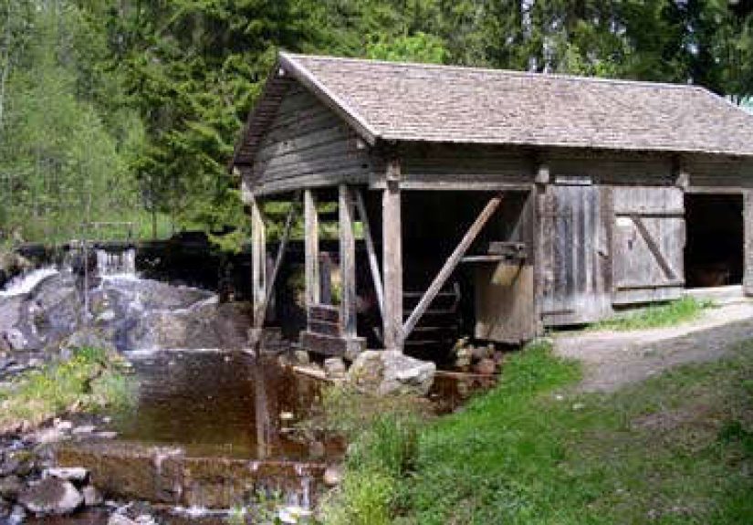
Moving into a new home is magicalright up until you realize every wall color is either “Rental Beige #4” or “Why Is This Gray Also Purple?” So we did what any reasonable adults do: we stared at paint chips until we forgot our own names, then built a whole-house color palette that actually makes sense.
This is the story (and the strategy) behind our new home color palette: how we chose a cohesive set of colors that flows room to room, works in different light, plays nicely with our floors and finishes, and still has enough personality to feel like usnot a sad waiting room.
The Big Idea: One Palette, Many Moods
A whole-house palette isn’t about painting every room the same color. It’s about creating a “family” of colors that share a common temperature and vibeso your hallway doesn’t feel like it leads to an entirely different zip code. We wanted continuity without boredom: calm, warm-leaning neutrals as the backbone, plus a few accent colors that show up like recurring characters in a good TV series.
Our rule: pick a consistent undertone direction (warm or cool), choose a dependable base neutral, then layer supporting colors that repeat across rooms in different proportions. In other words, less “paint roulette,” more “planned joy.”
Step 1: Audit the Stuff You’re Not Painting
Before we picked a single swatch, we did a quick home “inventory” of the permanent or pricey elements: flooring, countertops, tile, cabinetry, stone, and big furniture we weren’t replacing. These are your palette’s boss levelignore them and the colors you love will suddenly look… unemployed.
Our quick checklist
- Flooring undertone: warm honey oak, neutral oak, gray-washed, or deep espresso?
- Hard finishes: creamy tile vs. bright white tile; warm marble vs. cool quartz.
- Metals: brushed nickel (cool), brass (warm), matte black (neutral-bold).
- Textiles: rugs and upholstery we already owned and actually like.
We discovered our home’s “fixed” elements leaned warm-neutral overall, so we steered away from icy grays and ultra-blue whites that can clash and make everything feel slightly… medical.
Step 2: Choose a Base Neutral (And Commit Like It’s a Tattoo)
The base neutral is the color that quietly holds the entire house together. It shows up on most walls, transitional spaces, or trimbasically, it’s the color doing the most emotional labor.
We picked our neutral using three “non-negotiables”
- It had to be warm-leaning or truly balanced. Many “neutral” colors have sneaky undertones (pink, green, violet). We wanted something that stayed friendly in daylight and didn’t turn weird under warm bulbs at night.
- It needed the right brightness. A color’s Light Reflectance Value (LRV) helps estimate how light or dark it will read. In plain English: higher LRV = more light bounced around; lower LRV = moodier. We aimed for a light-but-not-blinding range for main areas.
- It had to flatter our floors. A perfect paint color in a vacuum can look wrong next to wood tones or stone. We kept our swatches near the floor and compared them at different times of day.
If you’re stuck between two neutrals, try the “squint test”: squint at both swatches against your floor or countertop. The one that blends more gracefully is usually the better long-term teammate.
Step 3: Build Room Palettes With the 60-30-10 Rule (Without Getting Bossy About It)
Once our base neutral was chosen, we used a simple design guideline to keep things balanced: the 60-30-10 rule. Think of it as training wheels for color confidence.
- 60% = dominant color (often wall color or large visual surface)
- 30% = secondary color (major furniture, cabinetry, rugs)
- 10% = accent color (pillows, art, small decor, a bold door… your fun stuff)
This let us repeat our palette across the home without making every room identical. Sometimes our dominant was a warm off-white; other times we flipped it and let a deeper color lead (hello, cozy office).
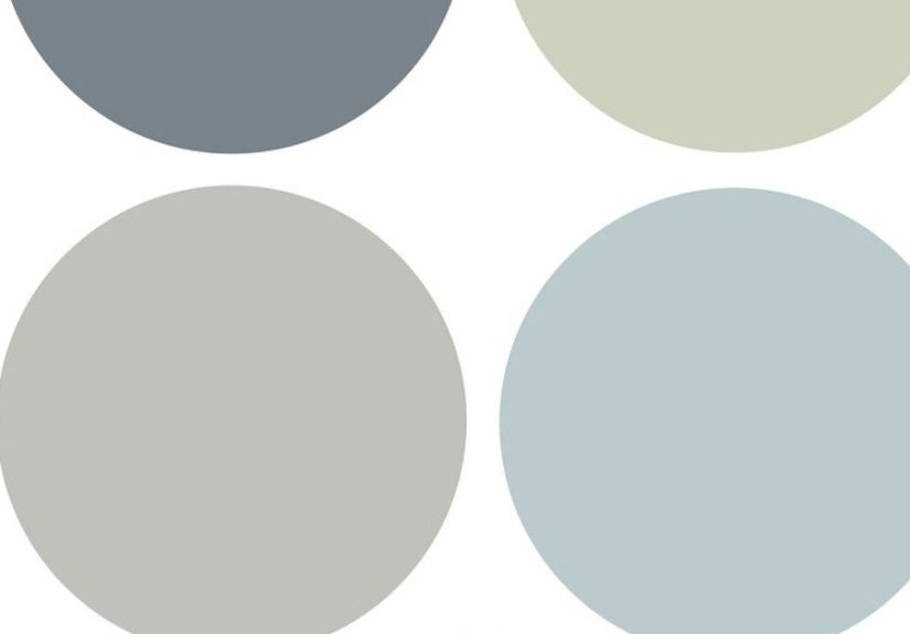
Our New Home Color Palette, Color by Color
Here’s the palette we landed onorganized by role, not by “what looked cute on a 1-inch chip under fluorescent store lighting.”
1) The Foundation: Warm White / Soft Off-White
This is our “clean canvas” colorbright enough to feel fresh, warm enough to feel welcoming. Great for main living spaces, halls, and anywhere you want light without harshness.
- Where we used it: open living areas, hallways, and ceilings where we wanted airy continuity
- Real paint examples: Sherwin-Williams Alabaster; Benjamin Moore White Dove
2) The Bridge Neutral: Greige / Warm Taupe
Greige is the social mediator of paint colors: it blends warm and cool elements and helps rooms feel grounded. We chose a greige that didn’t go green in afternoon light or pink at night (yes, that can happen, and yes, it feels personal).
- Where we used it: guest room, connecting spaces, and areas with lots of mixed lighting
- Real paint examples: Benjamin Moore Edgecomb Gray; similar warm greige options from major brands
3) The Natural Accent: Muted Sage Green
Sage is calm, timeless, and plays well with wood tones, leather, linen, and black metal. It adds color without shouting. In our home, it became the “nature note” that repeats gently through decor and a couple feature areas.
- Where we used it: kitchen-adjacent area, accent wall, and repeated in textiles/art
- Real paint examples: Sherwin-Williams Clary Sage; similar muted greens recommended by paint experts
4) The Cool Counterpoint: Dusty Blue / Slate Blue
We wanted one cooler shade for contrast, but not an icy one. Dusty blue gives that calm “exhale” feeling and looks especially good with crisp white trim and warm woodslike denim for your walls.
- Where we used it: bedroom accents, built-ins, and decor moments (not every walljust enough)
- Real paint examples: Sherwin-Williams Smoky Blue or comparable dusty/slate blues
5) The Bold Neutral: Charcoal / Soft Black
A soft black or charcoal makes everything around it look more intentional. We used it like eyeliner: strategically and with confidence. It anchors the palette and adds modern depth without going full cave.
- Where we used it: doors, select trim, a couple furniture pieces, and metal accents
- Real paint examples: Sherwin-Williams Iron Ore; other soft black/charcoal classics
6) The Warm Pop: Terracotta / Clay
This was our “joy color.” Terracotta adds warmth and personality, and it pairs beautifully with sage, warm whites, and natural textures. We used it in small dosesbecause too much clay can start feeling like you accidentally moved into a cinnamon stick.
- Where we used it: art, textiles, and one small accent area
- Real paint examples: Sherwin-Williams Cavern Clay; similar clay/terracotta tones
Step 4: Let the Light Boss You Around (Just a Little)
Light changes everything. Morning sun, afternoon glare, cloudy days, warm bulbs at nightpaint will shapeshift through all of it. We stopped asking, “Do I like this color?” and started asking, “Do I like this color at 8 a.m., 2 p.m., and 9 p.m.?”
Room direction basics
- North-facing rooms: cooler, more consistent light; warm undertones help keep rooms from feeling chilly.
- South-facing rooms: brighter, warmer light; many colors look more intensesoften with balanced or slightly cooler neutrals.
- East-facing rooms: bright mornings, calmer afternoons; great for gentle, fresh colors.
- West-facing rooms: warmer afternoon/evening glow; can intensify warm colors and make some neutrals look golden.
In our north-facing spaces, we leaned into warmer whites and avoided colors that looked “perfectly crisp” in the store but turned icy at home. In brighter rooms, we used slightly deeper or more muted tones to keep things from looking washed out.
Step 5: Sheen Matters (Yes, Even If You Wish It Didn’t)
Paint sheen affects how much light bounces off a surface. Higher gloss reflects more light and can make color look richerand also highlight wall imperfections like it’s auditioning for a detective show.
Our practical sheen map
- Ceilings: flat/matte (calm, forgiving)
- Main walls: eggshell or matte (soft, livable, easier to clean than flat)
- Trim and doors: satin or semi-gloss (durable, crisp definition)
- Bathrooms/kitchens: often satin/eggshell for wipeability (and consider ventilation)
We also learned that “the same color” in different sheens can look like two different colors. So we chose our wall color first, then tested trim in a higher sheen next to it to make sure the undertones still got along.
Step 6: Test Like You Mean It
We don’t trust tiny swatches anymore. They’re adorable liars.
What actually worked for us
- Go big: test large sample areas or use big paint sample sheets you can move around.
- Test in multiple spots: one wall can be sunny while another is in permanent shadow.
- Check it in real life: morning, afternoon, evening, plus lights on and lights off.
- Compare against “true white”: it helps reveal undertones you can’t unsee later.
We also pulled fabrics, wood samples, and a couple favorite decor items into the room during testing. If the paint made our rug look sad, it was a no.
Step 7: Make It Flow Room to Room
Cohesion happens when you repeat a few elements intentionally. We repeated our warm white on trim, used the greige as a “connector” in transition zones, and let the accents (sage, dusty blue, terracotta, charcoal) show up in smaller, consistent ways.
How we handled open spaces
In open floor plans, color can help “zone” areas without adding walls. We kept the main wall color consistent and used accent colors through cabinetry, built-ins, rugs, and decor to define areas (kitchen vs. living, for example). It feels intentional, not choppy.
Common Mistakes We Skipped (So You Can, Too)
- Ignoring undertones: neutrals are not neutral if they clash with your floors.
- Choosing under store lighting: your home lighting will humble that decision fast.
- Too many “favorite” colors: a whole-house palette isn’t a rainbow audition.
- Forgetting bulb temperature: warm bulbs can yellow a white; cool LEDs can flatten warmth.
- All eggshell, everywhere, forever: match sheen to function (and wall texture reality).
Our 500-Word Real-Life Color Adventure (A.K.A. What It Actually Looked Like)
The honest version of choosing “Our New Home Color Palette” starts with a perfectly normal sentence: “Let’s just pick a simple white.” That sentence was immediately followed by three weeks of chaos, twelve sample pots, and at least one moment where we stood in the hallway whispering, “Is this… pink?”
At first we tried to be spontaneouslike the kind of people who can buy jeans without trying them on. We grabbed a few popular warm whites and a couple greiges, held them up to the wall, nodded seriously, and told ourselves we were basically interior designers now. Then we taped the swatches up and watched them transform throughout the day like tiny color gremlins. The “clean” white turned icy in the morning. The “neutral” greige looked faintly green near the kitchen. And one shadeone single innocent-looking shadewent full lavender at 9 p.m. under warm bulbs. We didn’t choose it, but we still talk about it like it was a ghost sighting.
The turning point was when we stopped testing paint in isolation. We dragged our rug corner into the room, propped a throw pillow next to the swatch wall, and leaned a wood cutting board against the baseboard like it belonged there. That’s when everything clicked: colors don’t live alone. They share space with floors, furniture, art, and whatever random object you leave on the counter for two weeks. (In our case: scissors and a mysterious single sock.)
We also learned to test bigger. Tiny swatches made every option look “fine,” which is not the same as “right.” So we painted larger sample squares and taped up bigger sample sheets, moving them from sunny walls to shadowy corners. We did the full routine: coffee-light test, midday test, evening-lamp test, and the highly scientific “stand across the room and squint” test. The best colors didn’t scream for attention; they quietly made the room feel calmer and the existing finishes look better.
The funniest part? Once we landed on the palettewarm white base, friendly greige bridge, sage and dusty blue accents, charcoal grounding moments, and a pinch of terracottawe realized it matched the stuff we already loved. Our favorite mug. The art we kept. The cozy sweater we always reach for. The palette felt like us, not like we copied a showroom. Now when we walk from room to room, the house feels connected. Not identicaljust in conversation. And we finally stopped introducing ourselves to paint chips by name.
Conclusion
Our new home color palette works because it’s built on real-life constraints (light, floors, finishes), then sprinkled with real personality (sage, dusty blue, terracotta, and a confident charcoal). If you take one thing from our process, let it be this: choose a base neutral you trust, test colors in your actual lighting, and repeat your accents like a good design chorus. Your home will feel cohesive, comfortable, and unmistakably yours.