Table of Contents >> Show >> Hide
- Quick idea to keep you sane
- Step 1: Name the exact thing you’re aligning (and the direction)
- Step 2: Align text and inline content with text-align
- Step 3: Center a block element with margin: 0 auto (when it has a width)
- Step 4: Use Flexbox when you’re aligning items in one dimension
- Step 5: Use CSS Grid when you want alignment in two dimensions
- Step 6: Align inline and inline-block elements with vertical-align (when appropriate)
- Step 7: Override alignment for one “special” child with align-self / justify-self
- Step 8: Use positioning for overlays and “must-be-exact” centering
- Step 9: Make alignment responsive (without hard-coding heights)
- Step 10: Debug alignment like a pro (not like a panicked raccoon)
- Common alignment scenarios (quick recipes)
- Real-world “alignment experiences” developers run into (and how to win)
- Conclusion
“Just center it.” Four words that have launched a thousand developer sighs. The good news: aligning stuff in HTML isn’t mysteriousit’s just picky. The better news: modern CSS gives you multiple clean, predictable ways to align text, images, buttons, and full layouts without summoning ancient rituals (or the deprecated <center> tag).
This guide walks you through 10 practical stepswith specific examplesso you can stop nudging things with random padding and start aligning with confidence. (Your future self will send you a thank-you card. It will be perfectly centered.)
Quick idea to keep you sane
In HTML, alignment is almost never an “HTML problem.” It’s a CSS layout problem. And layout boils down to one question:
Are you aligning content inside a box, or aligning the box itself?
- Align content inside a box: text, inline elements, icons, and children inside a container.
- Align the box itself: a card, image, or section you want centered within its parent.
Once you know which one you mean, the correct CSS becomes a lot less… interpretive.
Step 1: Name the exact thing you’re aligning (and the direction)
“Align this” can mean at least six different things. Before you touch CSS, answer these:
Ask these three questions
- What’s the target? Text? An image? A
div? A row of buttons? - Where is it aligning? Inside its parent, or the parent inside something else?
- Which axis? Horizontal (left/right), vertical (up/down), or both?
Bonus question that solves half of alignment bugs: What is the element’s display type? (inline, block, inline-block, flex, grid.)
Mini example: “Center a button” can mean two different jobs
Job A uses text alignment. Job B uses layout alignment. Same sentence, different universe.
Step 2: Align text and inline content with text-align
If your target is text (or inline-level content like links inside a paragraph), text-align is usually the cleanest move.
Center text inside a block
Common gotcha
text-align aligns inline content inside a container. It does not magically move a block-level element itself. If you try to center a div with text-align, that div will look at you like, “Cool story. Anyway…”
Step 3: Center a block element with margin: 0 auto (when it has a width)
To center a block (like a card) within its parent, the classic pattern is:
Why it works (and when it doesn’t)
- Works: when the element is block-level and has a defined width or max-width.
- Doesn’t work: if it’s full-width by default (common with
div) and you never constrained its width.
More flexible version (great for responsive)
Using margin-inline is also friendlier for different writing directions.
Step 4: Use Flexbox when you’re aligning items in one dimension
Flexbox is the go-to tool for aligning items in a row or a column. Think nav bars, button groups, toolbars, “icon next to text,” and “center this thing inside that thing.”
Center items horizontally and vertically
How to remember justify-content vs align-items
justify-contentaligns along the main axis.align-itemsaligns along the cross axis.
The axis changes if you switch flex-direction. That’s why “it was centered yesterday” sometimes becomes “why are you like this?” today.
Pro tip: use gap instead of margin-hacking
Step 5: Use CSS Grid when you want alignment in two dimensions
Grid is fantastic when you want to align items both horizontally and vertically with minimal fuss, especially when you’re dealing with a layout that naturally has rows and columns.
The “center anything” grid trick
Align the whole group vs each item
- Item alignment in cells:
justify-items,align-items, orplace-items - Grid tracks/content inside container:
justify-content,align-content, orplace-content
If things aren’t moving, you might be adjusting the wrong level (the items vs the grid content).
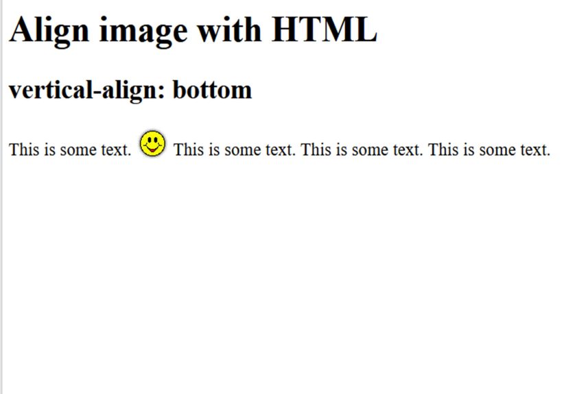
Step 6: Align inline and inline-block elements with vertical-align (when appropriate)
Need an icon to line up nicely with text? Or an inline image that sits a little too low like it’s tired? vertical-align can helpbut only for inline, inline-block, and table-cell contexts.
Icon + text alignment (classic use case)
When NOT to use it
If you’re trying to vertically center a whole section of a page, skip vertical-align. That’s Flexbox/Grid territory.
Step 7: Override alignment for one “special” child with align-self / justify-self
Sometimes you want a container’s children mostly aligned one way… except for that one child that thinks it’s the main character. CSS gives you a polite way to do that without rewriting the entire layout.
Flexbox: align-self on a child
Grid: justify-self / align-self on a child
Step 8: Use positioning for overlays and “must-be-exact” centering
Modern layout tools should be your first choice. But when you’re building overlays, tooltips, and modals, positioning is still useful.
Center an absolutely positioned element with transform
Two warnings (because your future self deserves peace)
- Positioning removes the element from normal flow, which can cause overlaps if you’re not careful.
- Prefer Flexbox/Grid for layout; use positioning for overlays and special effects.
Step 9: Make alignment responsive (without hard-coding heights)
Alignment that looks perfect on your laptop can fall apart on a phone if your layout depends on fixed heights, magical pixel numbers, or vibes.
Use flexible sizing
max-widthandmargin-inline: autofor centered containersmin-heightinstead ofheightfor vertically centered sectionsgapand wrapping to avoid crushed layouts
Example: center content, but let it breathe on small screens
Also: don’t forget “alignment” includes whitespace
Sometimes the element is aligned correctly, but the surrounding spacing makes it look off. Adjust padding/margins intentionally instead of “just add 7px until it feels right.”
Step 10: Debug alignment like a pro (not like a panicked raccoon)
When alignment “doesn’t work,” it usually means one of these is true:
Fast checklist
- You’re aligning the wrong thing: content vs container.
- The element isn’t the display type you think it is: inline vs block vs flex vs grid.
- The parent has no size to align within: vertical centering needs height (often
min-height). - You picked the wrong axis: flex direction flipped your mental model.
- Default styles are interfering: headings, paragraphs, and lists ship with margins.
Use a temporary outline to see the real boxes
Do this for 30 seconds in DevTools and suddenly the “mystery gap” becomes “oh, that’s the default margin on the <h2>.”
Common alignment scenarios (quick recipes)
Center an image inside a container
Center a fixed-width layout on the page
Center one button while others align differently
This trick works because auto margins absorb extra space inside flex containers.
Real-world “alignment experiences” developers run into (and how to win)
If you’ve built even one web page, you’ve probably lived some version of these moments: you center something, it looks perfect, and then someone adds one more word, one more button, or views it on a phone… and suddenly your layout is doing interpretive dance.
One of the most common experiences is trying to center a card with text-align: center and wondering why the card refuses to move. What actually happened is: you centered the text inside the parent, not the card itself. The fix is usually margin: 0 auto (if the card has a width) or a layout tool like Flexbox/Grid (if the card is part of a bigger layout). Once you internalize “content vs container,” alignment stops feeling like luck and starts feeling like plumbing: predictable, even if not glamorous.
Another classic: “vertical centering doesn’t work.” Most of the time, the container has no meaningful height. Flexbox can center items vertically only within the space it has. If the container’s height is just the height of its contents, there’s nothing to center withineverything is already taking up the only space available. The real-world fix is usually adding min-height (like min-height: 60vh) or centering within a section that actually spans space. This is why hero sections often use viewport units: they create a real canvas for alignment.
Developers also frequently experience “why did justify-content stop working?” The surprise is that justify-content only distributes extra space. If your flex items already fill the container (or you’ve got no spare room), there’s nothing to distribute, and it looks like the property is being ignored. In practice, you may need to reduce item widths, allow wrapping, or check that you’re applying it to the correct element (the flex container, not the child).
Then there’s alignment in UI componentslike an icon next to text in a button. People often try to push the icon down with padding or negative margins until it “looks right,” but it breaks the moment font size changes. The more durable experience-based solution is either vertical-align: middle for inline icons or a tiny flex wrapper: display: inline-flex; align-items: center;. That way, when text size changes (accessibility settings, user zoom, different devices), the alignment stays stable.
Finally, the “mystery gap” experience: your section looks off-center, but every alignment property seems correct. Nine times out of ten, it’s default margins on headings/paragraphs, or the browser’s line-height/inline formatting behavior. The fastest real-world habit is toggling an outline in DevTools and inspecting spacing. You don’t have to guess where the space comes fromyou can literally see it. Once you stop debugging by vibes and start debugging by boxes, alignment becomes a set of repeatable moves instead of a late-night thriller.