Table of Contents >> Show >> Hide
- Start with a Plan: Build a Palette That Actually Works
- Read the Light First, Then Pick the Paint
- Undertones: The Secret Sauce of Neutrals
- Sheen & Finish: Make Your Color Look Expensive
- Trend-Savvy, Timeless Results
- Room-by-Room Color Play
- Make Small Spaces Feel Bigger (or Cozier on Purpose)
- Sampling Like a Pro: Reduce Regret, Increase Delight
- Designer Moves That Always Elevate
- 2025–2026: Use Trends; Don’t Let Them Use You
- Put It All Together (A Mini Playbook)
- Conclusion
- Real-World Experiences: What Homeowners and Designers Learned from Decorating with Color ()
Color shouldn’t be scary. It’s just light, pigment, and a little courage. This guide turns “hmm, maybe beige again?” into confident, room-by-room color choiceswith practical tips you can use this weekend.
Start with a Plan: Build a Palette That Actually Works
Good color isn’t randomit’s a recipe. Begin with a simple framework so every choice supports the next.
The Color Wheel, Demystified
Think of the color wheel as your GPS. Complementary colors (opposites like blue and orange) create pop; analogous colors (neighbors like blue, blue-green, green) feel calm and cohesive; triadic schemes (three evenly spaced hues, such as red–yellow–blue) are lively but balanced. Use one family as the star and the others as backup singers.
The 60–30–10 Rule (and When to Bend It)
A timeless way to pull a room together: devote about 60% of the space to your main color (walls, large rugs), 30% to a supporting color (sofa, drapes), and 10% to an accent (pillows, art, a side chair). Want a bolder look? Split the accent into two 10% moments for extra rhythmjust steal a little from the 60 or 30 so the math still works visually.
Read the Light First, Then Pick the Paint
Paint doesn’t live in a vacuumit changes with daylight, bulbs, and surroundings. Understanding light helps you avoid “Why does my perfect gray look purple?” syndrome.
LRV: The One Number That Predicts How a Color Will Behave
Every paint color has a Light Reflectance Value (LRV) from 0 (black) to 100 (white). Higher LRV colors bounce more light and feel brighter; lower LRV colors absorb light and feel moodier. Use higher LRVs in dim spaces (north-facing rooms, basements) to keep things airy, and moderate or lower LRVs to add depth where light is abundant.
Room Direction Cheat Sheet
- North-facing: Light skews cool. Choose warmer undertones (creamy whites, beiges, clay pinks) to balance.
- South-facing: Light is warm and plentiful. Cool hues (blue-greens, crisp whites) stay fresh, deeper colors look luxurious.
- East-facing: Morning glow, afternoon cool. Aim for flexible mid-tones that don’t wash out at noon.
- West-facing: Flat at noon, fiery at sunset. Avoid overly warm walls unless you love rich evening drama.
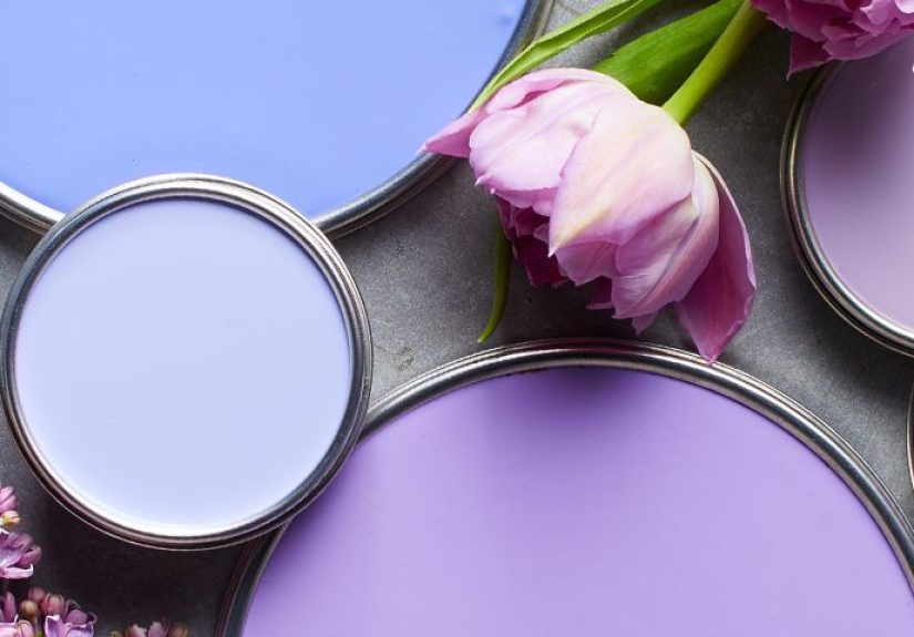
Undertones: The Secret Sauce of Neutrals
Whites, grays, and beiges always carry a quiet second coloran undertone. That’s why “the perfect white” can suddenly look pink or green at home. Quick test: place the swatch on plain white printer paper and compare it to a few similar swatches. The sneaky undertone reveals itself next to neighbors.
Warm undertones (yellow, red, peach) feel cozy and inviting; cool undertones (blue, green, violet) feel crisp and calm. If your fixed finishes (countertops, tile, flooring) skew warm, pick paint with compatible warmth so the room reads intentional, not “almost right.”
Sheen & Finish: Make Your Color Look Expensive
The finish (sheen) you choose alters both the look and durability of your color.
- Flat/Matte: Low reflection hides wall flaws; beautiful in low-traffic rooms and ceilings. Touches up easily.
- Eggshell: The crowd-pleasersoft glow, easier cleaning than matte. Great for most living spaces.
- Satin/Pearl: A bit more shine and scrub-abilitynice for busy hallways, kids’ rooms, and flexible spaces.
- Semi-gloss: Durable and wipeable; ideal for trim, doors, and humid zones like baths and laundry.
- High-gloss: Glamorous, mirror-like drama for accents (a lacquered door, a statement cabinet). Surface prep must be perfect.
Pro move: vary sheen to create subtle architecture. Use eggshell on walls and semi-gloss on trim in the same colorthe light shift adds dimension without adding more hues.
Trend-Savvy, Timeless Results
Trends are tools, not rules. Earthy browns, mossy greens, rich oxbloods, and glowing oranges are headlining many 2025 palettes, while soothing blue-greens continue to dominate serene spaces. “Color drenching” (wrapping walls, trim, even the ceiling in one hue) is still popular for libraries, bedrooms, and small rooms, but use it where you want immersion, not everywhere. Pair statement colors with grounded neutrals so the eye can rest.
Color of the Year watch: Warm, grounded browns and refined, nature-forward greens continue to lead industry pickseasy to live with, elegant in matte finishes, and undeniably photogenic.
Room-by-Room Color Play
Living Room: Welcome + Wow
Let your largest space set the home’s tone. Try a mid-tone neutral (greige, taupe, soft clay) for walls, then layer color with textiles: a rust velvet pillow, indigo throw, sage ottoman. If you want an accent wall, choose a shade that already appears in your rug or art so it belongs. For open plans, coordinate two neighboring palettesanalogous hues zone spaces without clashing.
Kitchen: Appetite, Meet Harmony
Paint lower cabinets a saturated hue (inky blue, olive, merlot) and keep uppers light to balance visual weight. If your counters and backsplash have strong pattern, dial back wall color with a quiet warm white. Satin or semi-gloss on cabinets improves durability; eggshell or satin on walls stands up to splatters.
Bedrooms: Calm, Cocoon, or Both
For serene retreats, try blue-gray, dusty green, or creamy off-white with a low-contrast palette throughout. Prefer drama? Choose a mid-dark hue with a soft LRV (navy, forest, aubergine) and drench the headboard wall, then soften with linen and wood. Keep sheen low (matte/eggshell) for restful light.
Bathrooms: Small Space, Big Payoff
Light, low-contrast palettes make compact baths feel larger (pale blue, soft green, warm white). Where humidity runs high, upgrade sheen to satin or semi-gloss for wipeability. Consider painting the ceiling the same color as the walls to visually lift odd angles.
Kids’ Rooms & Playrooms: Color with a Plan
Choose a versatile wall neutral and let accents do the growing up: change bedding, art, and rugs as interests evolve. Zoning color (a painted rectangle behind a desk, a soft arch above the bed) adds function and fun without repainting everything later.
Make Small Spaces Feel Bigger (or Cozier on Purpose)
- Go light and low-contrast when you want airiness: walls, trim, and ceiling in closely related tints bounce light around.
- Use deeper hues strategically to add depth: a dark end wall can elongate a narrow room; a dark ceiling can cozy up a tall, echoey space.
- Mirror the undertone of hard finishes (tile, stone) so everything reads calm, not choppy.
Sampling Like a Pro: Reduce Regret, Increase Delight
- Shortlist three to five options per room (a warm, a cool, and a neutral option plus a wild card).
- Paint large swatches (at least 18"×24") on poster board so you can move them around. View mornings, afternoons, evenings.
- Check beside fixed finishes (flooring, tile, counters) and under your actual lighting (2700K vs. 3000K bulbs change everything).
- Decide on sheen with the same samplemany stores can provide sheen sticks or sample boards so you can compare reflection.
Trust your eye over the paint chip name. “Cozy Cloud” might be gorgeous in a showroom and lilac in your foyer. Your light is the boss.
Designer Moves That Always Elevate
- Unify trim through the whole house. One trim color (often a versatile warm white in semi-gloss) ties rooms together even when wall colors change.
- Repeat accents three times. A peppering of the same huein a lamp base, pillow piping, and artlooks purposeful.
- Color-block architectural features. Wrap a doorway, niche, or bookcase in the wall color for a built-in feel.
- Test the fifth wall. Painting the ceiling the wall color (or a half-shade lighter) removes high-contrast lines and makes rooms feel modern and calm.
2025–2026: Use Trends; Don’t Let Them Use You
Industry forecasts spotlight warm browns, earthy greens, muted oranges, and soft blue-greens. Translation: nature-rooted color that plays well with wood, stone, and textiles. If you love bold, dive in via a powder room or dining room. If you’re cautious, bring trend colors through rugs, throws, and art against a tried-and-true neutral walleffortless to update later.
Put It All Together (A Mini Playbook)
- Audit your light (direction + brightness) and note fixed finishes.
- Choose a palette framework (analogous for calm; complementary for pop).
- Set 60–30–10 targets so purchases don’t drift.
- Pick sheen by durability (eggshell walls, semi-gloss trim are reliable defaults).
- Sample big, decide slowlyone evening can change everything.
Real-World Experiences: What Homeowners and Designers Learned from Decorating with Color ()
Ask a dozen people about their biggest color win and you’ll hear a theme: sampling changed everything. One couple renovating a north-facing condo thought they wanted a “clean gallery white.” On the wall, it looked cold and a little blue. Swapping to a warm white with a slightly higher LRV transformed the spacesame furniture, entirely different mood. Their takeaway: white isn’t neutral until it’s neutral in your light.
Parents designing a shared kids’ room learned how undertones keep the peace. Their flooring leaned orange; cool gray walls clashed. They pivoted to a greige with a whisper of warmth and used the 60–30–10 rule to edit toys and textiles. The room felt calmer overnight because the walls and floors finally agreed. Lesson two: when in doubt, match undertones to fixed finishes first, personalities second.
A busy household tried the “color-drenched powder room” trend and discovered why small, contained spaces are perfect for bold experiments. They painted the walls, trim, and ceiling in a deep teal satin and replaced a standard mirror with an antique brass oval. The rest of the home stayed airy and neutral, so guests experienced a jewel box momentmemorable, not overwhelming. Their advice: bold color belongs where you want theater, not where you want recovery.
In open plans, homeowners often struggle with where one color stops and another begins. A designer shared a simple method: pick a unifying trim color throughout the home, then choose two related wall colors (say, a warm putty and a gentle sage). Repeat each at least twiceentry + hallway, kitchen + diningso the eye recognizes a rhythm. The spaces read connected yet purposeful. Key insight: repetition makes color feel intentional.
Sheen choices delivered some surprising lessons, too. One DIYer used matte in a high-traffic hallway and hated the scuffs. After repainting in eggshell, the walls cleaned up beautifully without looking shiny. Another upgraded bathroom walls to satin and found condensation no longer left drip marks. The finish didn’t change the color, but it sure changed the experience of living with it.
Finally, people who love seasonal switch-ups leaned into a strategy that saves both money and time: keep walls in flexible mid-tones and let accents do the mood swings. In summer, swap in breezy linen and coastal blues; in fall, rotate to rusts and olive throws. The core palette stays stable, the house still feels “you,” and storage bins become your secret design weapon.
If there’s one universal lesson from these lived-in stories, it’s this: color confidence grows with small, smart experiments. Sample bigger. Watch the paint at breakfast and at dusk. Choose sheen for how you live, not just how it looks. And repeat your accent colorson a pillow, a lampshade, a book spineso rooms feel curated rather than chaotic. Do this, and your home won’t just look good in photos; it’ll feel good on Tuesday at 7 p.m., which is when design really matters.