Table of Contents >> Show >> Hide
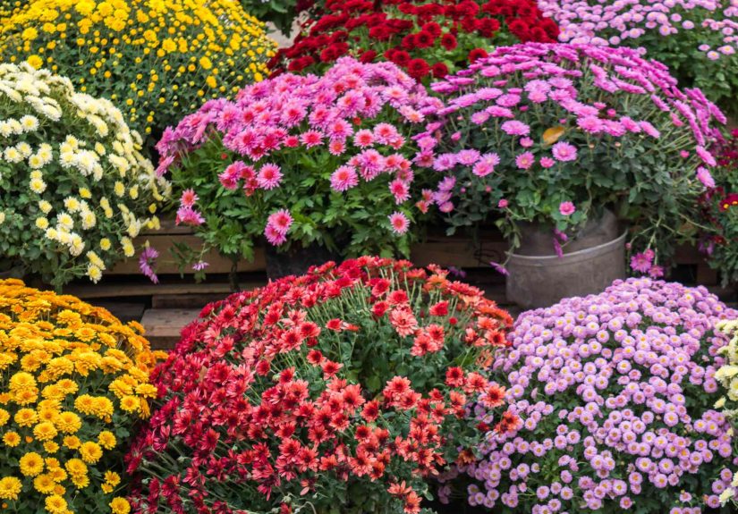
If you think mums come in only two moodsyellow and “porch orange”it’s time for a floral intervention. Chrysanthemums have been unfairly typecast for years as the dependable fall plant you grab on the way home, park by the front steps, and forget until Thanksgiving leftovers appear. But modern garden mums are far more stylish than that. Depending on the cultivar, you can find blooms in creamy white, chartreuse green, coral, apricot-pink, burgundy, lavender, and more. In other words, mums are not just the backup singers of autumn. They can absolutely be the headliners.
That wider color range is one reason garden mums remain such a favorite for late summer and fall landscapes. They bloom when many other plants are fading, and they come in a surprising variety of flower forms too, from daisy-like singles to pompons, decoratives, spoons, and spiders. The result is a plant that can look soft and romantic, bold and saturated, or downright dramatic depending on the color you choose. So if your mental picture of chrysanthemum colors is still stuck in “harvest aisle at the grocery store,” let’s fix that.
Why Mums Look So Different From One Another
Before we get to the colors, here’s the fun little secret: not every mum is trying to be the same plant. Garden mums and florist mums are often lumped together, but hardy garden mums are the ones most people use outdoors for landscape color. They also vary widely in flower form, bloom time, and cold tolerance. That means the same color can look totally different depending on whether the petals are quilled, spoon-shaped, decorative, or daisy-like. A soft pink single-flowered mum can feel airy and casual, while a packed decorative bloom in a similar shade looks plush and almost velvety.
Color is also influenced by how the bloom ages and how the light hits it. Some red mums deepen into burgundy tones. Some bronze cultivars lean orange in bright sun and coppery in the afternoon. And certain green mums can shift from lime to yellow-green as the flowers mature. That’s part of the charm. Mums are not static little paint chips from a hardware store; they’re living color, and they like to show off a bit.
15 Stunning Mum Colors You Probably Didn’t Know Existed
1. Pure White
White mums are crisp, elegant, and wildly underrated. They bring a clean brightness to fall containers, especially when paired with black planters, ornamental kale, or deep purple foliage. Unlike louder shades, pure white mums feel polished and calm, which is helpful if your porch already has pumpkins, lanterns, hay bales, and enough plaid to start its own country band. Cultivars in the white category can range from bright snow-white to softer whites with creamy centers, so you can choose a cooler or warmer look depending on your setup.
2. Cream
Cream mums are what happen when white decides to relax a little. This shade has a softer, richer look that works beautifully in neutral fall arrangements. Creamy blooms blend well with beige pumpkins, weathered wood, and muted grasses, making them perfect for a more refined autumn palette. They also help bridge bright and pastel plantings, so if you want a display that feels layered rather than loud, cream is a smart choice. Think of it as the oat milk latte of mum colors: soft, fashionable, and everywhere once you start looking.
3. Lemon Yellow
Not all yellow mums are the same, and lemon yellow proves it. This color is brighter, cleaner, and a little fresher-looking than the deeper gold tones people usually associate with fall. Lemon yellow mums pop beautifully in mixed containers and brighten up tired borders without feeling heavy. They pair especially well with blue planters, silver foliage, and purple companion plants. If your usual autumn display starts to look a little too pumpkin-spice everything, lemon yellow adds a sharper, cheerier note.
4. Peaches-and-Cream
Now we’re getting fancy. Peaches-and-cream mums have that blended, almost hand-painted effect that makes people stop and squint in a good way. These blooms often combine soft peach, cream, and warm pastel bronze tones, creating a gentler version of classic fall color. They are especially good in cottage-style gardens or mixed beds where you want warmth without going full traffic-cone orange. This shade also photographs beautifully in late-afternoon light, which is handy if your garden exists partly for your own happiness and partly for your camera roll.
5. Flame Orange
Flame orange is the high-energy cousin of standard orange. It has more intensity, more glow, and more of that “hello, it is absolutely autumn now” attitude. In the garden, flame orange mums look bold against dark mulch, evergreens, and ornamental peppers. On porches, they practically vibrate with seasonal enthusiasm. This is the shade to choose if you want your fall containers to read festive from the sidewalk. It also plays nicely with yellow and red mums, creating a layered sunset effect that feels warm without looking chaotic.
6. Burnt Orange
Burnt orange is moodier, earthier, and more sophisticated than bright orange. It has a rust-like quality that makes it feel especially at home in fall landscapes. This shade is excellent in vintage-inspired or farmhouse-style displays because it harmonizes so well with terracotta, brown, copper, and weathered metal. If you like autumn decor that feels natural rather than flashy, burnt orange mums are a strong pick. They don’t scream for attention, but they absolutely know they look good.
7. Bronze
Bronze mums deserve more love because they’re one of the most distinctive colors in the chrysanthemum world. Bronze can pull from orange, brown, copper, and gold all at once, which gives it serious depth. These blooms often look especially rich in lower fall light, when they take on a glowing, metallic warmth. Bronze is ideal for gardeners who want something more complex than orange but still unmistakably seasonal. It’s the color equivalent of a really well-aged leather jacket: classic, textured, and impossible to mistake for basic.
8. Coral
Coral mums are unexpected in the best possible way. They sit somewhere between pink, peach, and orange, which makes them feel softer than traditional fall shades but still warm enough for the season. Coral is a great choice if you want your containers to look fresh and modern rather than theme-park autumn. It pairs beautifully with cream, burgundy, and even chartreuse accents. In mixed beds, coral mums can brighten the space without overpowering nearby plants, giving everything a more layered, designer-ish feel.
9. Salmon
Salmon mums bring a gentle, glowing warmth that reads almost luminous in early morning or evening light. This shade often carries pink outer petals with warmer or deeper tones toward the center, giving the flower extra dimension. Salmon works especially well in romantic garden schemes and with soft ornamental grasses. It’s also a brilliant transition color if you’re decorating between late summer and full autumn because it feels seasonal without being too dark or heavy. Basically, salmon is for people who want fall color with a little softness and zero shouting.
10. Apricot-Pink
Apricot-pink mums are one of those shades that make people ask, “Wait, that’s a mum?” The color is delicate but not weak, warm but not loud, and often looks especially charming on daisy-style blooms. It brings together the prettiness of spring pinks with the mellow richness of autumn tones. This is one of the best mum colors for soft cottage borders, layered patio pots, and plantings where you want a surprise that still feels natural. If standard fall mums feel too predictable, apricot-pink is your elegant plot twist.
11. Bright Pink
Bright pink mums are cheerful, energetic, and very good at refusing to blend into the background. They can make a fall container look instantly fresher and more playful, especially when combined with white or purple blooms. Some gardeners skip pink in autumn because they assume it belongs to spring or summer, but that’s exactly why it works so well. It breaks the routine. Against the tawny browns and fading greens of late season, bright pink reads as lively, modern, and a little rebelliousin the most charming possible way.
12. Lavender
Lavender mums are subtle show-offs. They don’t have the instant punch of red or orange, but they create a cooler, more refined look that stands out precisely because it is unexpected in fall. Lavender tones work beautifully with silver foliage, dusty blue containers, white pumpkins, and soft pink companion plants. They also pair nicely with ornamental cabbage and kale, which often carry similar cool undertones. If you love gardens that feel calm, layered, and just slightly dreamy, lavender mums are one of the smartest choices you can make.
13. Deep Purple
Deep purple mums have real drama. They add contrast, richness, and an almost velvety depth to fall plantings, especially when set near yellow, chartreuse, or white. Purple also helps anchor brighter colors, making mixed containers feel more intentional. A pot with yellow mums, purple mums, and trailing greenery can look incredibly lush without being complicated. This color is especially striking near entryways, where lower fall light gives the blooms a jewel-toned look. If orange is the extrovert of the mum world, deep purple is the mysterious friend in the great coat.
14. Burgundy Red
Burgundy red mums are richer and moodier than standard red, with wine-like tones that feel luxurious in autumn. They’re excellent for upscale-looking containers and porch displays because they add depth without the visual harshness that brighter reds can sometimes bring. Burgundy pairs beautifully with cream, bronze, and chartreuse, and it also looks fantastic beside pumpkins in pale blush or deep green. This is the shade to pick if you want something dramatic, slightly romantic, and unmistakably fall without going straight into Halloween territory.
15. Chartreuse Green
Yes, green mums are real, and yes, they are weirdly beautiful. Chartreuse-green blooms are one of the most surprising chrysanthemum colors available, and they make a fall arrangement look instantly more curated. Green mums work almost like a neutral, but a very stylish neutral that knows what color theory is. They pair with everything from bronze and burgundy to pink and white, and they bring a fresh edge to traditional autumn palettes. If you want your porch or garden to look less expected and more magazine-worthy, chartreuse is your secret weapon.
How to Choose the Right Mum Color for Your Garden or Porch
The easiest way to choose mum colors is to decide what mood you want. Warm shades like flame orange, burnt orange, bronze, and burgundy create a classic autumn look. Cooler shades like lavender, white, and green feel more modern and refined. Coral, salmon, apricot-pink, and bright pink sit in the middle, offering warmth without the standard harvest-catalog vibe. A simple rule helps: choose one anchor color, one brightener, and one contrast shade. For example, bronze plus cream plus chartreuse works beautifully, and so does purple plus lemon yellow plus white.
Flower form matters too. A daisy-style bloom often looks lighter and more casual, while dense decorative or pompon blooms make the color appear richer and fuller. If you’re mixing several colors in one container, use similar bloom forms to keep the arrangement cohesive. If you want more drama, mix forms on purpose. That’s how you turn a pot of flowers into a tiny fall performance.
How to Keep Those Colors Looking Good
Gorgeous color means very little if the plant flops like it just heard bad news. Garden mums perform best in full sun and well-drained soil. They also appreciate consistent moisture, especially because they are relatively shallow-rooted. If you want mums to return as perennials, spring planting is usually the best route because it gives roots time to establish before winter. Fall-planted blooming mums can still look amazing for the season, but they may not overwinter as reliably.
For bushier plants with more flowers, gardeners often pinch growing tips in late spring and early summer, stopping by about early to mid-July depending on climate and cultivar. That encourages branching instead of tall, floppy growth. Deadheading can also keep plants tidier and help maintain that colorful show. In other words, mums are not difficult, but they do appreciate a little basic respect. Sun, drainage, water, and decent timing go a long way.
What It’s Actually Like to Live With Unusual Mum Colors
If you’ve only ever bought one big yellow mum every October and called it seasonal decorating, trying unusual mum colors feels a little like discovering your favorite diner secretly serves excellent tiramisu. You thought you knew the place. You did not. The first surprise is how different the colors feel in real life compared with a plant tag or a quick glance at the garden center. Chartreuse mums can look almost electric on a cloudy day, while apricot-pink blooms glow softly at sunset. Burgundy mums seem almost formal near a front door, but place them beside ornamental grasses and they suddenly feel relaxed and romantic.
The second surprise is how much these colors change the whole mood of a space. A porch filled with orange and yellow mums feels cheerful and classic, which is lovely. But switch to cream, lavender, and green, and the same porch looks cleaner, calmer, and more current. Add coral and salmon instead, and it feels warm and inviting without looking like every other fall display in the neighborhood. That’s the magic of mum color: the plant itself may be familiar, but the palette can completely rewrite the story.
Unusual mum colors also make you notice your other plants more. Deep purple mums can pull hidden tones out of a smoky blue pot. Lemon-yellow blooms can wake up a tired border that has gone flat by late September. Bronze mums make dried seed heads, faded hydrangeas, and weathered wood look intentional instead of merely old. Even the wild card shades, like chartreuse green, turn out to be shockingly easy to use once you see them in person. They don’t fight with other colors. They sharpen them.
There’s also a practical pleasure in using a wider mum palette. When you mix different colors, your display tends to last visually longer because it feels more layered and dynamic as some flowers age and others peak. A mixed grouping of white, burgundy, coral, and bronze mums has more depth than a row of matching pots, and it usually looks better as the season progresses. The arrangement keeps changing, which is part of the appeal. Fall gardens are not static, and mums fit that rhythm perfectly.
Most of all, growing or decorating with these shades just makes autumn more fun. You stop treating mums like a yearly obligation and start using them like design tools. You notice the difference between salmon and coral, between bronze and burnt orange, between lavender and true purple. And once that happens, it’s very hard to go back to thinking of mums as just “those round flowers by the pumpkins.” Turns out they were stunning the whole time. They were simply waiting for better marketingand maybe for us to pay attention.